Most SaaS teams spend months on the homepage and an afternoon on the demo page. It should be the other way around. Organic search, paid search, LinkedIn, partner referrals, that conference booth: nearly every channel you pay for ends at one URL with a form on it. If that page leaks, every channel upstream looks worse than it really is.
We've been reworking demo pages for B2B SaaS clients this year, and this guide is the checklist we work from. Each recommendation comes with the research behind it, so you can see why it's there and push back on anything that doesn't fit your funnel.
Who actually lands on your demo page
A demo request used to be the start of the sales conversation. Now it sits much closer to the end of the buyer's research. In 6sense's 2025 Buyer Experience Report, buyers first contacted sellers about 61% of the way through their buying journey, and 94% of buying groups had already ranked their shortlist before they spoke to anyone. The same research found that the vendor contacted first still wins about eight out of ten deals.
Buyers are also reluctant to talk to sales at all. Gartner's 2026 sales survey found that 67% of B2B buyers prefer a rep-free buying experience.
Put those together and you have the person on your demo page. They've done the homework, you're probably on their shortlist already, and they'll book a call only if the call looks worth their time. That gives the page exactly two jobs:
Remove the last reasons not to book. Unanswered questions, missing proof, a form that feels like a tax return.
Tell sales who just raised their hand, so the right person shows up to the call prepared.
Everything below serves one of those two jobs. If a section on your page does neither, cut it.
The layout that works: proof on one side, form on the other
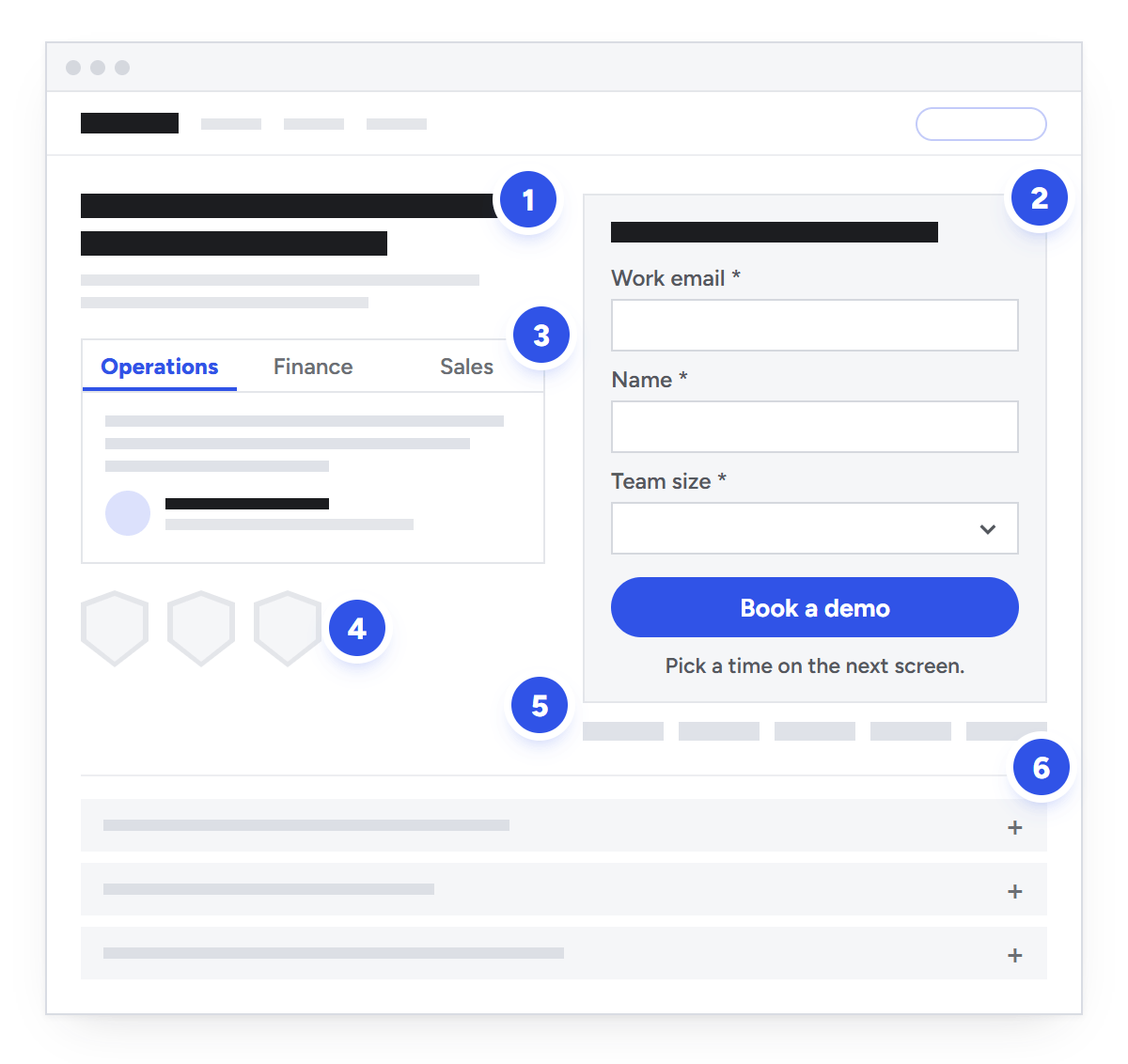
The structure we keep coming back to is a split screen. The form sits on one side, proof sits on the other, and both are visible on a laptop without scrolling.
This demo page, from a sales commission software company, is a clean example (at the time of writing). The left half has a one-line headline about peers, a testimonial card with tabs for Operations, Finance and Sales, and a row of G2 badges. The right half has a headline about the demo itself, two fields, a one-line consent note and the button. A strip of customer logos sits right under the form. Nothing on the page asks you to go anywhere else.
It works because the visitor never has to choose between reading proof and filling in the form. Their eyes move back and forth between the two, which is exactly what a hesitant buyer does anyway.
A split-screen demo page: (1) outcome headline, (2) the form, (3) proof matched to the buyer's role, (4) review or compliance badges, (5) what happens next and customer logos, (6) a short FAQ. On mobile, stack it as headline, form, then proof.
Here's what the page needs, roughly in order of importance:
A headline and a one-line subhead that say what the visitor gets.
The form, above the fold on desktop and near the top on mobile.
Proof next to the form: one strong testimonial (or a tabbed set), review badges and logos your buyers recognize.
A security or compliance line if you sell to enterprise or regulated buyers.
"What happens next" in two or three short steps.
A short FAQ for the objections your sales team hears most: price, call length, who'll be on the call.
Navigation is the decision people get stuck on. Our rule: the main demo page your site header links to keeps a slim header, because buyers use it to check pricing and then come back. Landing pages built for paid traffic can drop the nav entirely.
Write a headline about the outcome, not the meeting
"Book a demo" belongs on the button. The headline should tell visitors what they get out of the next 30 minutes. The example page above uses two headlines, one on each side of the split screen, and each does a different job:
Lead with peer proof. The left side opens with a line telling visitors their peers have never managed commissions better. It isn't a feature claim. It tells a RevOps or finance leader that people like them have already made this decision, and the testimonial card underneath backs it up.
Lead with the demo promise. The form headline reads "Experience a demo based on your own compensation plans." One sentence, and you know the call will be about your setup, not a canned tour.
If your category is new or hard to explain, there's a third option: lead with the product promise. Say what the product does in plain words, then back it up with one concrete claim about scale, speed or results.
Then answer the three questions every visitor has before booking. How long is it? Who will I talk to? Will it be about my situation? One line under the headline or the button is enough. Our own contact page says "30 minutes with a senior consultant, not a sales rep." It isn't clever. It just answers the worry people actually have before they book a call.
The form: fewer fields, better fields
How many fields is too many?
Nielsen Norman Group's form usability guidelines put it plainly: every time you cut a field or question from a form, you increase its conversion rate. Test data backs that up. In a 2013 MarketingSherpa experiment, adding a single job title field dropped conversion from 58% to 51%, an 11.9% relative decline at a 99% confidence level.
Field count isn't the whole story, though. CXL documents a test by conversion researcher Michael Aagaard in which removing three fields from a nine-field lead form cut conversions by 14%. Rewording the labels on the original nine fields, on the other hand, lifted conversions by 19.2%. The fields that cost you are the ones that feel invasive or pointless. Fields that help a buyer describe their situation can earn their place.
Our rule of thumb: every field needs a job. It routes the lead, qualifies it or shapes what the demo will cover. If sales doesn't use an answer to decide who takes the meeting or what to show, delete the field. If an enrichment tool can fill it in from the email domain (company size, industry, location), don't ask for it.
Field
Keep it?
Why
Work email
Yes
The key for enrichment, routing and the calendar invite.
Name
Yes
The rep needs it for the invite and the first email.
Company size or volume, as a range
Yes
The fastest way to send SMB and enterprise leads to the right rep.
One "what's your situation?" question
Yes
Tells the rep what to show. Use checkboxes or a dropdown, not a text box.
Company name
Optional
Enrichment can usually fill it from the email domain.
"How did you hear about us?"
Optional, last
Useful self-reported attribution. Never make it required.
Phone number
Rarely
High friction for little gain if the meeting gets booked on the next screen anyway.
Job title
Rarely
See the MarketingSherpa test above. Enrich it instead.
Budget or timeline
No
That's what the call is for.
Use two steps when you need qualifiers
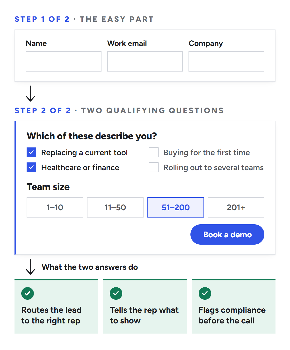
If routing needs more than three or four answers, split the form in two. Step one asks for the easy stuff. Step two asks the qualifying questions.
A typical version: the first screen asks for name, work email and company. The second asks one or two questions with tick-box or range answers, such as "Which of these describe you?" and a team size or monthly volume range. Those two answers are usually enough to route the lead and decide what the demo should focus on. An answer that points to a regulated industry, like healthcare or financial services, can also flag a compliance conversation before the call starts.
Two steps: the easy fields first, then one or two qualifying questions that route the lead and shape the demo.
The example page makes the opposite trade: one email field and one dropdown for the number of salespeople. Friction stays at a minimum, and enrichment and the call itself handle the rest of the qualifying. Both approaches are reasonable. Ten required fields on one screen is not.
Mark required fields. NN/g's research on required fields recommends an asterisk on every one. Better still, make every field required and remove the optional ones.
Use one column. Baymard Institute's testing found that single-column layouts led to fewer skipped fields, misread fields and errors than multi-column layouts. Short, related fields such as first and last name are the usual exception.
Validate politely. Check a field after the visitor leaves it, not on the first keystroke, and clear the error as soon as it's fixed. Baymard's benchmark found that 31% of e-commerce sites still don't offer inline validation, so it's an easy place to be better than average.
Add autocomplete attributes. Tag fields with autocomplete="email", given-name, family-name and organization so browsers can fill the form in one tap. Google's web.dev guidance says to use an autocomplete value wherever one fits the field.
Don't block personal email addresses unless you never sell to small businesses. Flag them and route them differently instead.
Check what your form tool actually supports. HubSpot's progressive fields swap questions a contact has already answered for new ones on return visits. The HubSpot knowledge base now labels the feature legacy and says it isn't supported in the updated form editor.
Put proof next to the form, not three scrolls down
Peer proof shapes shortlists more than most teams assume. In G2's 2026 buyer research, review sites (38%) were the top source shaping which vendors made a buyer's shortlist, edging out AI chatbots (37%) for the first time. The TrustRadius 2026 B2B Buying Disconnect report found that 74% of buyers use reviews to inform their purchase decisions.
Proof should sit where the decision happens, which is next to the button.
Use testimonials with names, titles and specifics. "Great product, great team" persuades no one. On the example page, a RevOps director at a well-known fintech company describes salespeople coming to him to say they really like the new commission tool. That's a specific moment from a named person at a company buyers recognize. A number, such as hours saved or disputes avoided, would make it stronger still.
Match the proof to the persona. The example page's testimonial card has tabs for Operations, Finance and Sales, so a finance leader reads what another finance leader said. It packs three quotes into one component without the guesswork of an auto-rotating carousel.
Show logos your buyers recognize, ideally from their own segment. Ten logos from the wrong industry do less than three from the right one.
Add review badges and a rating if you have them. A star rating with the review count next to it tells buyers more than a badge on its own.
Put security where enterprise buyers can see it. If you have SOC 2, ISO 27001, HIPAA or GDPR coverage, say so in one line under the headline or next to the button. It answers a procurement question before anyone asks it.
Close the gap between "submitted" and "booked"
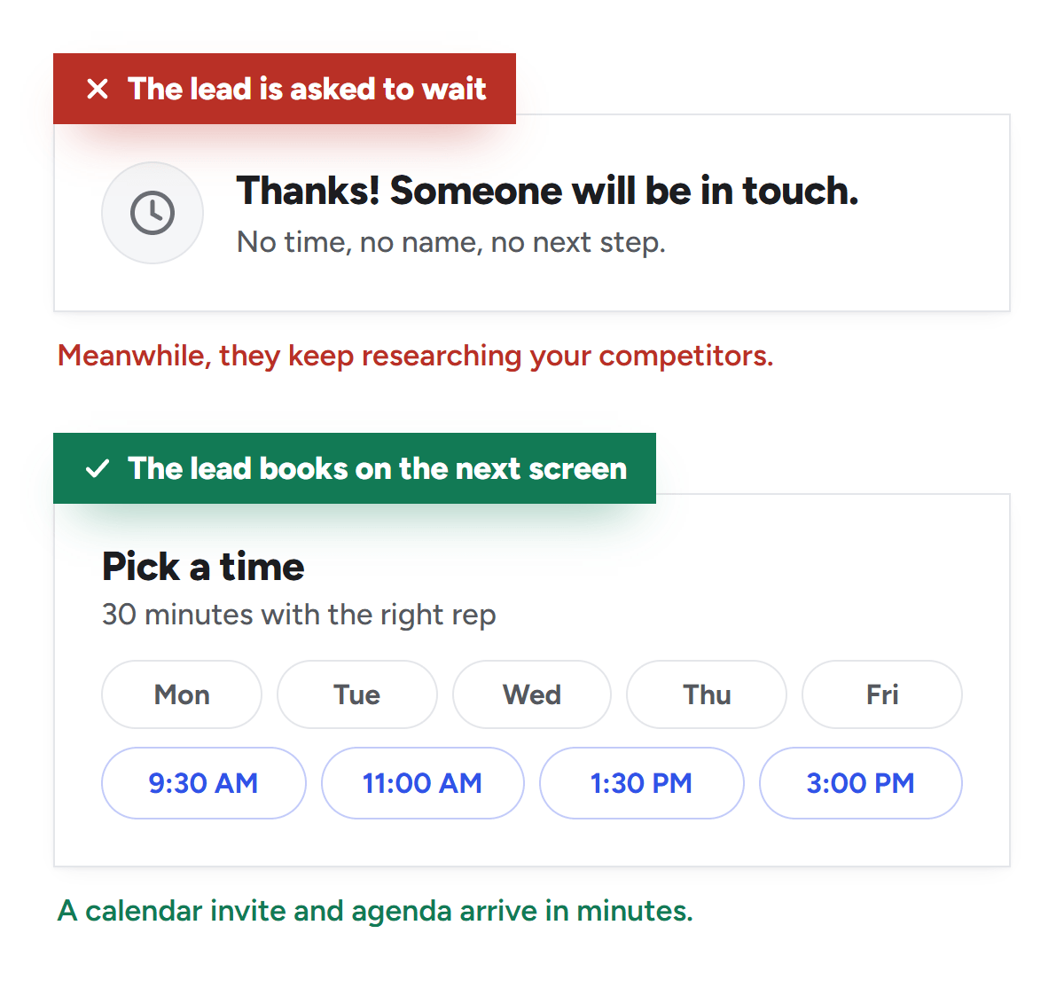
The most expensive moment on a demo page comes after the click. A buyer who submits the form and sees "Thanks, someone will be in touch" has just been asked to wait, and buyers who wait keep researching your competitors.
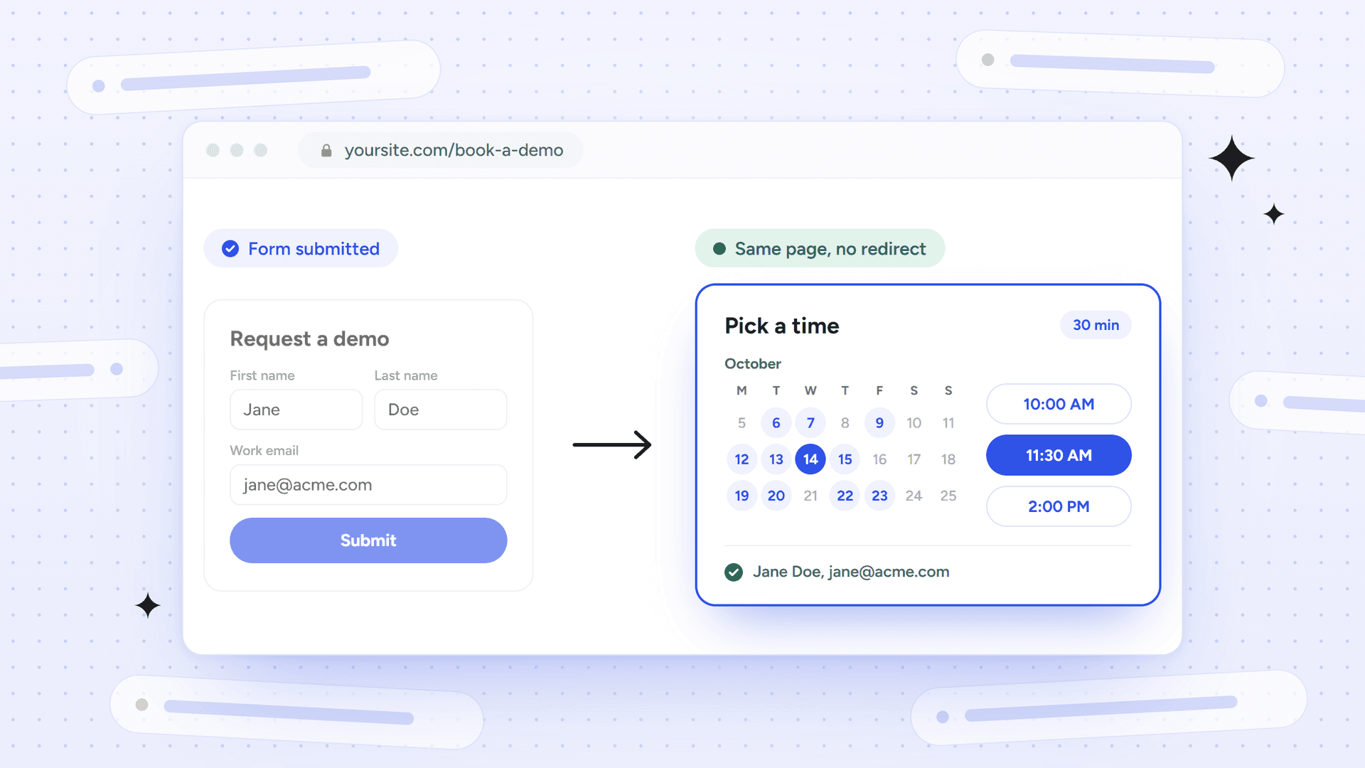
The same click, two outcomes: a thank-you page that asks the buyer to wait, or a calendar on the next screen.
The classic research here is still HBR's study of online sales leads. Companies that tried to contact a lead within an hour were nearly seven times as likely to qualify it as companies that waited even an hour longer. A separate audit in the same article found that the average response time, among companies that responded at all, was 42 hours, and 23% never responded. The research is from 2011, but nothing published since suggests buyers have become more patient.
Instant scheduling fixes most of this, because qualified visitors pick a time on the very next screen. Even then, nothing is guaranteed. Chili Piper's 2025 benchmark, based on nearly 4 million form submissions across its customers, found that 66.7% of qualified submissions go on to book a meeting. That's vendor data from teams that already offer instant booking, and it still means a third of qualified demand walks away at the calendar step.
What we'd do:
Show the calendar on the next screen for leads that meet your routing rules. Send everyone else to the right self-serve path, such as a trial, the pricing page or a product tour.
Route on the answers they just gave (size, region, use case), so they meet the right rep the first time.
Say what happens next under the button. For example: "Pick a time on the next screen. You'll get a calendar invite and a short agenda."
Send the confirmation within minutes, with the rep's name and a line about what the call will cover.
Offer a no-call option.Navattic's 2026 report found that 18% of the 5,000 B2B SaaS websites it sampled now have an interactive demo CTA. A "take the product tour" link is a good second path for buyers who'd rather skip the rep entirely, and the Gartner data says that's most of them.
Make it fast and easy to use, on mobile too
Demo pages tend to be heavy: a third-party form embed, a scheduling script, a chat widget, analytics and a few ad pixels. Speed matters more here than almost anywhere else on the site. In Deloitte's "Milliseconds Make Millions" study for Google, which covered 37 brands and more than 30 million sessions, a 0.1-second improvement in mobile site speed came with 8.4% more retail conversions and 10.1% more travel conversions. On lead generation sites, progression from the first form step to submission rose 21.6%.
Aim for Google's Core Web Vitals thresholds at the 75th percentile of page loads: Largest Contentful Paint within 2.5 seconds, Interaction to Next Paint of 200 milliseconds or less, and Cumulative Layout Shift of 0.1 or less. The usual fixes on demo pages:
Reserve space for the form embed so the page doesn't jump when it loads.
Load the chat widget after the form is usable, or leave it off this page.
Preconnect to your form and scheduling domains.
Test on a mid-range phone over mobile data, not on office Wi-Fi.
Accessibility belongs on the same list. Labels or instructions for every input are a Level A requirement under WCAG 2.2 Success Criterion 3.3.2. Make sure the form works with a keyboard, and that error messages say what's wrong in words rather than only turning a border red. If you'd like help with the technical side, it's a big part of our technical SEO services.
SEO for your demo page
The demo page is rarely a big traffic page, but it's where your organic traffic converts, and it should be the page that ranks for branded, high-intent searches like "[your brand] demo".
Index it and give it a real title tag. "Book a Demo | Brand" wastes the space. Something like "[Product] Demo: See [Outcome] in 30 Minutes | [Brand]" gives searchers a reason to click.
Link to it wherever it makes sense: the header CTA, pricing, comparison pages, integration pages and the end of high-intent blog posts.
Noindex the thank-you page so it stays out of search results. Use a noindex meta tag and don't also block the URL in robots.txt. Google's documentation is clear that crawlers which can't fetch the page will never see the noindex.
Don't design for FAQ rich results. Google stopped showing them in Search on May 7, 2026. Keep an FAQ because buyers need one, not for a SERP feature.
Track the conversion that matters. Count booked (and held) meetings, synced to your CRM and ad platforms, not raw form submissions. When we set up paid search for a SaaS client this fall, we optimized bidding to demo bookings only, not free sign-ups. If your ad accounts still optimize to form fills, our paid ads consulting team can help fix that.
Plan for AI search. In G2's research, AI chatbots were a close second to review sites in shaping buyers' shortlists. Keep the demo page crawlable, and make sure the pages AI assistants tend to quote (pricing, security, comparisons) link to it. That's a core part of our SEO for B2B SaaS work.
How we plan a demo page before anyone opens Figma
Our process starts in a plain document, not a design tool. We lay the page out as a table that mirrors the real layout, with one row per section and the columns matching the split screen. Final copy goes in the cells. Screenshots or quick mockups go where components will live, such as the form, the logo strip and the badges. Notes for the designer are highlighted in yellow, along the lines of "below is a three-tab single component".
It sounds low-tech, and that's the point. Stakeholders argue about copy and structure in a doc, where changes are cheap. The designer gets every word up front, so the first design review is actually about design. And because the copy comes straight from the live site and from customer quotes that are already approved, nothing gets made up along the way.
We usually start from a reference page we admire and map each of its sections to the client's version. Where the reference shows a G2 rating, the client might show its compliance line. Where the reference has a two-field form, the client might keep the real two-step form its sales team relies on. The layout gets borrowed. The content stays honest.
Measure the whole funnel, then test one thing at a time
Unbounce's 2024 conversion benchmark puts the median SaaS landing page conversion rate at 3.8%, compared with 6.6% across all industries. Use that as a sanity check, not a target. A demo page's conversion rate depends far more on who you send to it than on anything you change on the page.
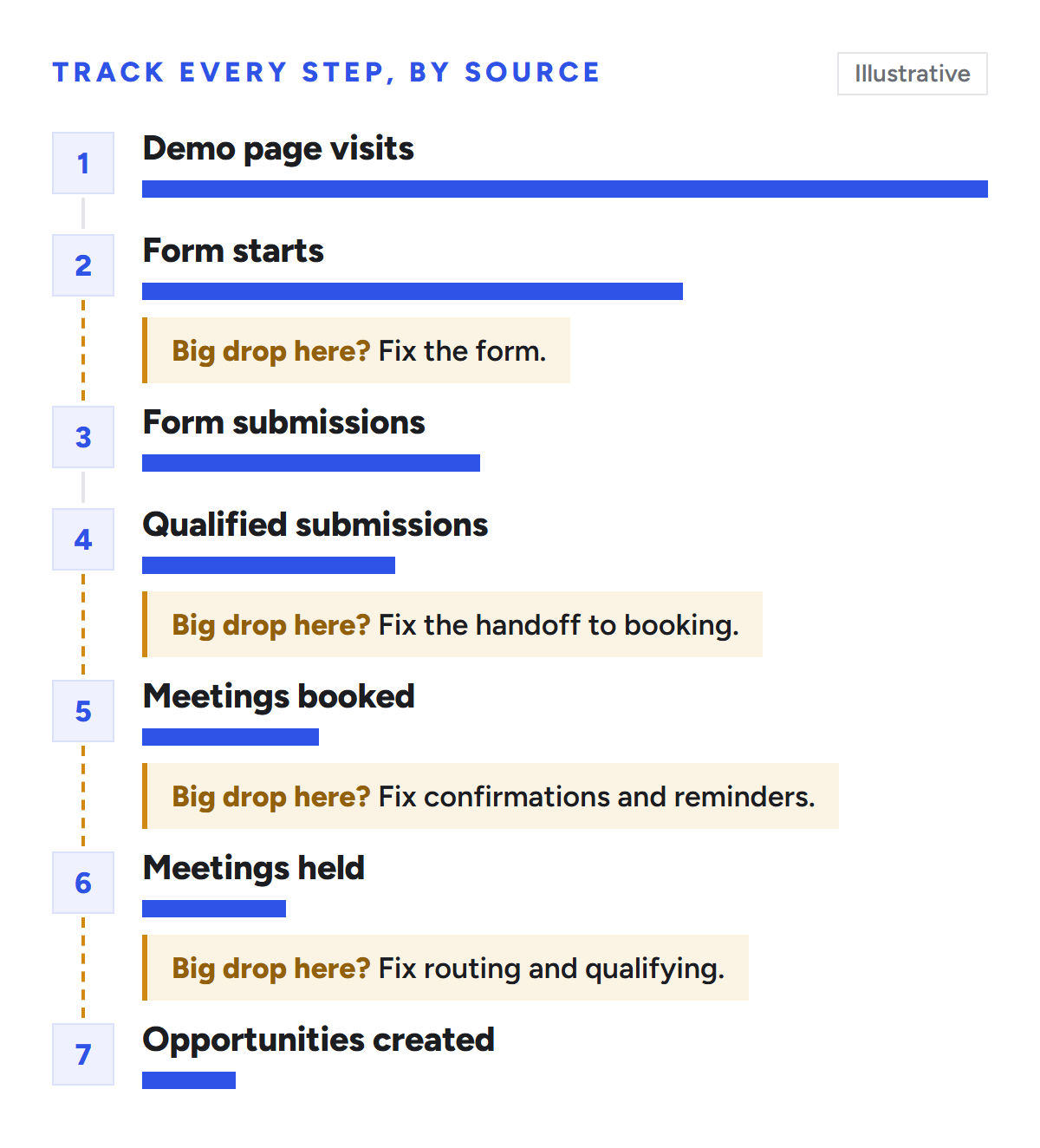
Track every step, broken down by traffic source:
Demo page visits
Form starts
Form submissions
Qualified submissions
Meetings booked
Meetings held
Opportunities created
The biggest drop tells you what to fix. Plenty of starts but few submissions means the form is the problem. Plenty of submissions but few bookings points to the handoff. Bookings that don't show up point to your confirmation and reminder emails. Meetings that never turn into opportunities usually mean your routing or qualifying questions are off.
Track each step by traffic source. The step with the biggest drop tells you what to fix first.
When you start testing, change one thing at a time, roughly in this order: instant booking, then the headline and "what happens next" copy, then the fields and qualifiers, and finally where the proof sits.
Before you ship: a quick checklist
The headline says what the visitor gets, not "Book a demo".
The form and your strongest proof are visible together on a laptop screen.
Every field has a routing, qualifying or personalization job.
Labels sit above the fields, required fields are marked and the form is one column.
Qualified leads can book a time on the next screen.
"What happens next" is written under the button.
Testimonials have names, titles, companies and, ideally, numbers.
Security and compliance are visible if you sell to enterprise or regulated buyers.
There's a no-call option, like a product tour, for buyers who aren't ready to talk.
The page passes Core Web Vitals on mobile.
The demo page is indexed and the thank-you page is noindexed.
You track booked and held meetings, not just form fills.
Frequently asked questions
How many fields should a book a demo form have?
As few as your routing needs. For most B2B SaaS teams that's three to five: work email, name, one sizing question and one question about the buyer's situation. If you need more, split the form into two steps and enrich the rest from the email domain.
Should I use a form or a calendar link?
Use both, in that order. The form tells you who the person is so you can route them, and the calendar on the next screen lets qualified buyers book before they cool off. A bare calendar link gives you no routing and no qualification.
Should a demo page show pricing?
If you can, show a starting price or link to your pricing page. Buyers who can't find pricing tend to either leave or book a demo just to ask what it costs, and neither helps your pipeline.
Should the demo page be indexed by Google?
Yes. It's where branded, high-intent searches should land. Noindex the thank-you page instead, and don't block it in robots.txt.
What's a good conversion rate for a SaaS demo page?
There's no universal number. Unbounce's benchmark puts the median SaaS landing page at 3.8%, but demo pages vary widely with traffic mix. Your own baseline, broken down by source, is the number to beat.
Want a second opinion on your demo page?
If your demo page gets traffic but not meetings, we're happy to take a look. Mission SEO works with B2B SaaS teams on SEO, AI search and paid search, and the demo page is where all of it pays off. Book your free strategy call: 30 minutes with a senior consultant, not a sales rep.
We’re a B2B SEO and AEO agency. Book a free 30-minute call with a senior consultant: we look at your site before we talk, so you leave knowing what to fix first.

 best project management software